|
I learnt about animating texts and lowering volume and adding a few effects. I found it difficult trying to mash all the videos together properly without making it weird. It also got weirdly cut for some reason. The animated lower thirds thing didn't work for me for some reason so I spent 20ish minutes trying to get that to work. Other than that it was similar as before. using effects to manipulate clips and audio wasn't that hard compared to what I thought.
0 Comments
I found it easy to cut and organize the videos as I had more time for the video. I cutted the videos differently compared to what I would have done with just solid images. My overall thoughts are the same as before as it is similar to the previous assignment. Time constraints were the hardest part.
Music Used: https://www.bensound.com/royalty-free-music/track/sunny
I found working with videos a bit harder than photos as I couldn't shorten the video without either speeding it up or cutting off an important bit. I found it easy to adjust and cut videos compared to last time as I have gotten used to it a bit more now. I found it harder to adjust it as the clips had a subject that was constantly doing something which made it hard for me to add and cut stuff without going over the 20 seconds. I think that using Primere Pro is most likely easier than other video editing softwares though I haven't had prior experiences.
I added more transitions with the video clips. I also cut the video differently compared to just static images. Adjusting the timeline was the most difficult again as the video was limited sometimes but it wasn't too difficult. It isn't too hard and is easier than I thought it would be after getting adjusted to it.
The program kept crashing so I had to use the 2023 version. Editing the images and dragging them in and out of the timeline and editing the length of each clip was the hardest. I found the easiest thing to be just adding the audio. I have no strong opinions about Premiere Pro as I only used one other video editing program.
Written ReflectionI wanted to create a poster for Cookie Run because I was running out of ideas and I have been playing the game franchise for 8 years. I chose the font because I didn't know how to download other fonts on my PC because I worked on this at home and it fits the bubbly theme Cookie Run has. I used the pen tool and the circle gradient tool to make the gradients work well and to create the shapes. I chose the warm colors cause the opening of the game is when the cookies are being cooked and I wanted it to be analogous colors. 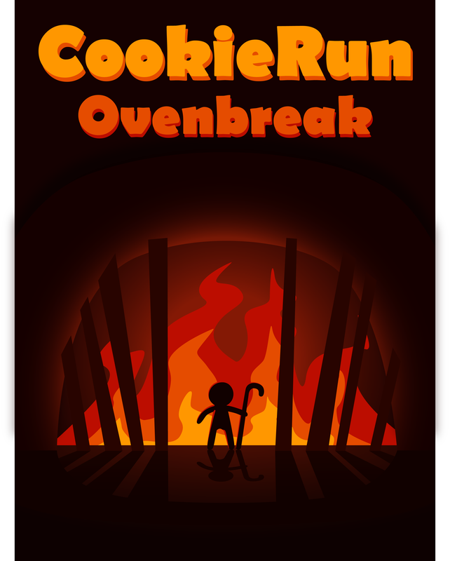 Written ReflectionI learned how to use the grid tool with this project. I chose the character I designed for that one project a while ago because I liked that character and I liked the design I gave for them. I had some difficulties with the colors I chose because I made it really dark and it sometimes would blend in with the original black sketch. I also worked on this until 2 am so I had to fix a lot of the coloring later as I messed up on some parts. Since the previous check, I learnt how to use Adobe Illustrator and how to better color and style 3d models in 3ds Max. My skills for Adobe Photoshop has also grown since last quarter as well. I struggled with turning assignments in as I was sick for a week and a lot of homework piled on me while I was unable to walk towards my computer to work during the week. I plan on improving using Photoshop and hope that I can also do more 3d modeling and learn how to use Photoshop even more and perhaps learn how to use more Adobe programs such as Adobe Animate which I am learning at home.
Written ReflectionI am very sorry this took too long, I was sick for a week and had a lot of assignments. I used the font Berlin Sans because it looked silly and it matched the very real ingredients that very real burgers have. It feels less serious compared to fonts like Times New Roman and fits the viberant colors well. I created the soda with more difficulty than I thought because the lines would refuse to align properly, same with the fries. I was going to make this more seriously but I have a lot of missing assignments and I made the ingredients very real and not inedible. I used vibrant colors because it distracts people from the very real ingredients and is also good to look at and appeals to children who can convince their parents to buy the very real burger.  Written Reflection This assignment helped improve my skills with the pen tool as it helps me use it alongside other tools such as the shape builder tool. It made me use the pen tool to create more and more complex shapes such as the wings looking logo and the ones with the flags. I like the last logo i made, it looks the best out of the ones I made. 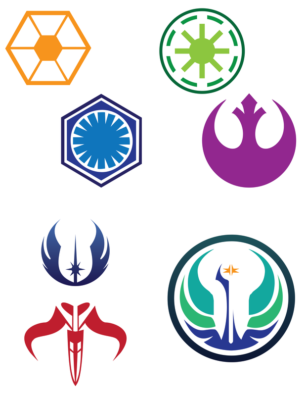 |
